TPC Training
Client
Website Design
Services
I created a full website redesign for TPC Training that effectively combines multiple brands under one roof, creating an easy-to-navigate marketplace for employees to find and complete their training, with a UI that stands out from the rest of the industrial training industry. ABOUT TPC TRAINING TPC Training provides industrial and compliance solutions for companies looking to train their employees so they can safely and effectively perform their jobs.
Combining several brands under one roof
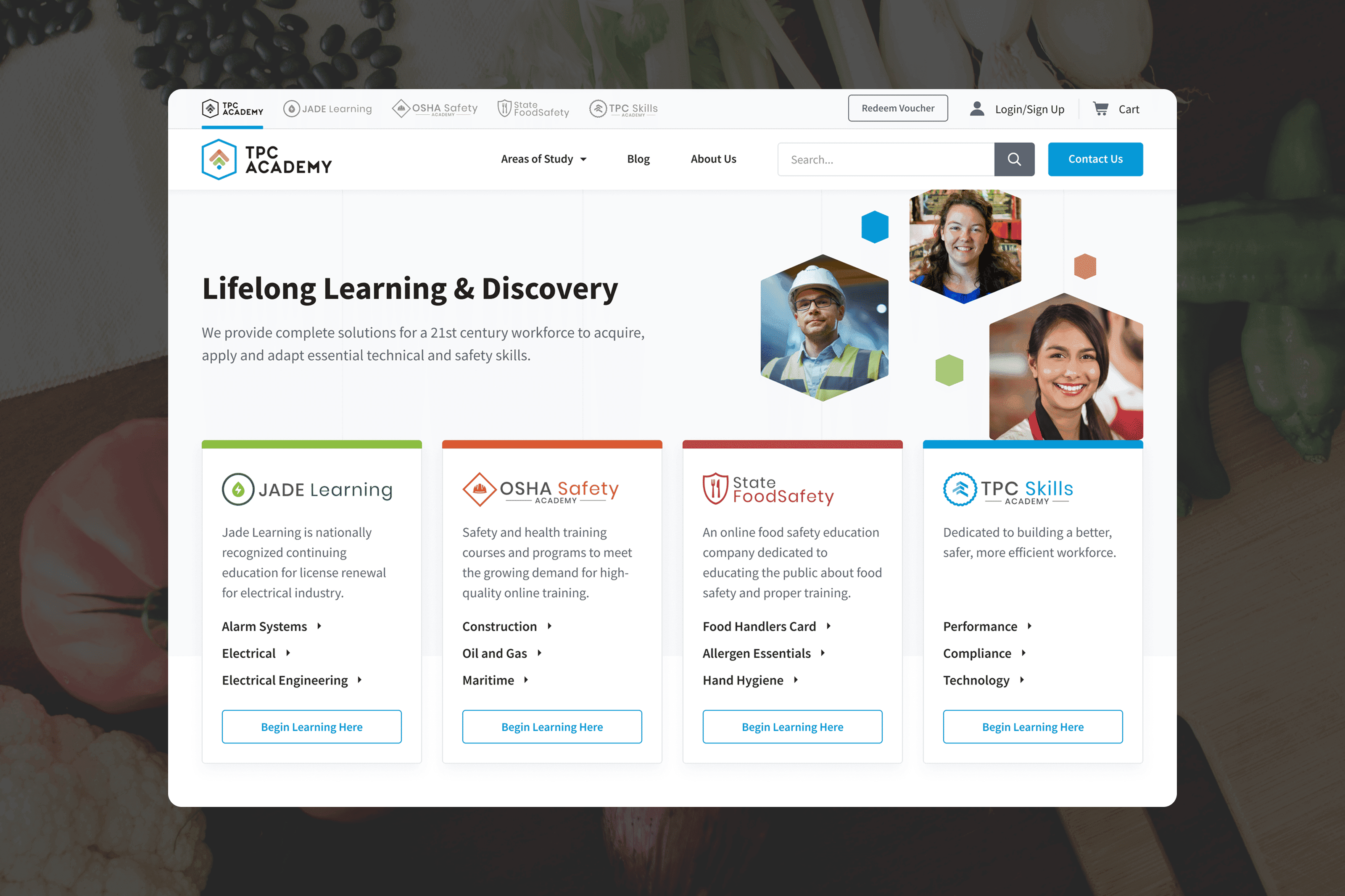
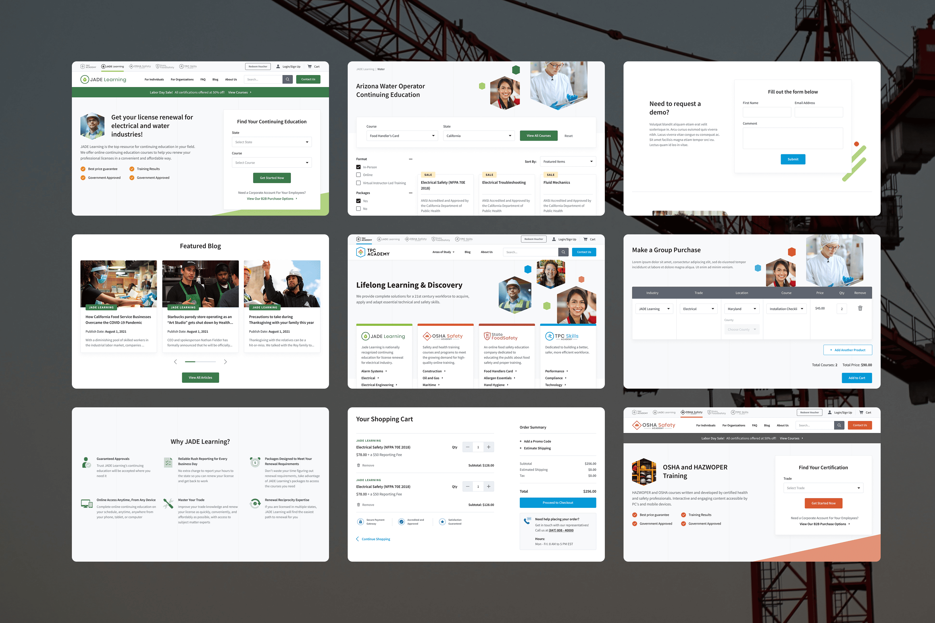
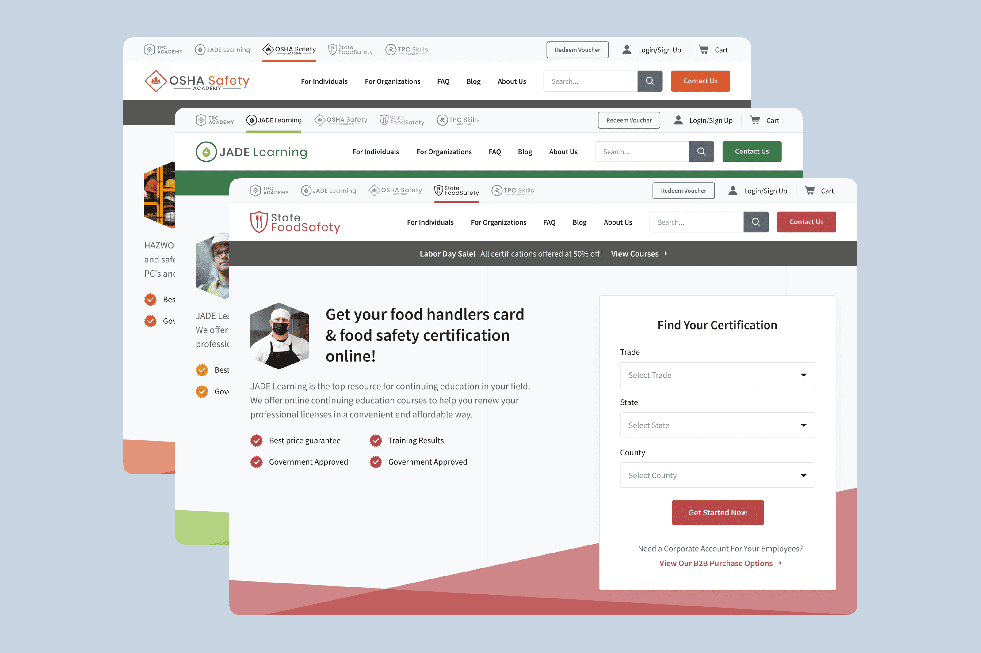
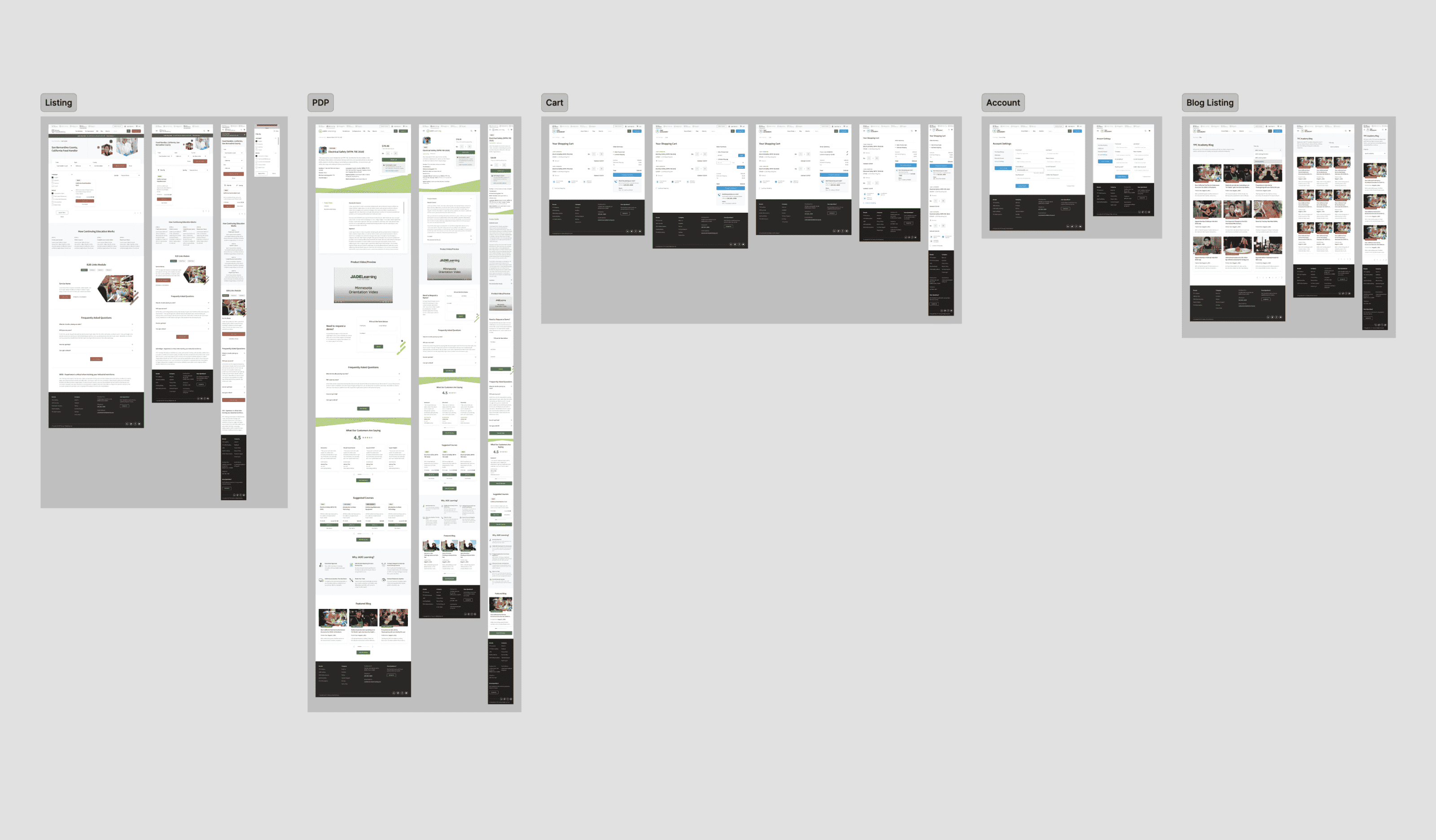
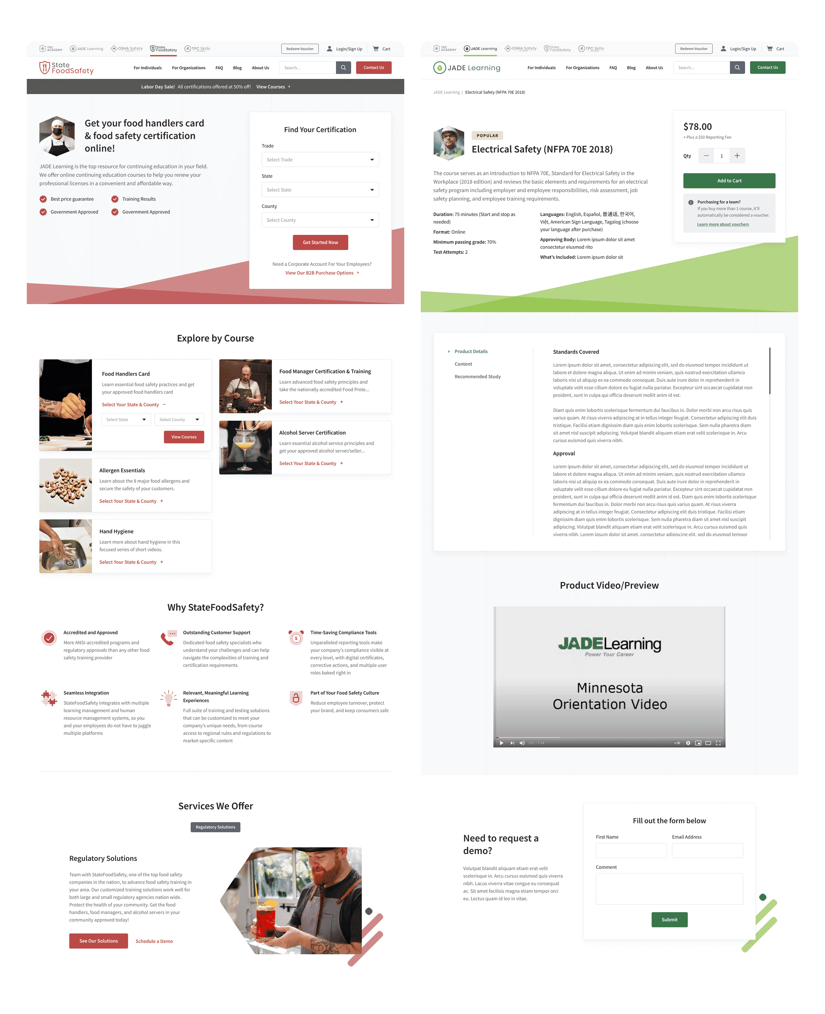
Having recently acquired a collection of brands like JADE Learning, OSHA Safety Academy, and StateFoodSafety, TPC was also in the midst of rebranding themselves from TPC Training to TPC Academy to differentiate their company from the lackluster training sites that had become prevalent in their industry. TPC wanted to combine the brands they acquired under one roof, while implementing their updated branding. After several strategy calls with the client to discuss their visual identity and technical requirements, we set out to create a more robust and user-friendly website for TPC Training. This new website matches their updated style guide and serves as a central hub for trainees to get to their required courses right from the TPC website. With multiple brands under their belt, making sure that the user experience while navigating the website feels consistent, and the visual style cohesive. It’d be really jarring for the user if it felt that they were suddenly redirected to another website because the UI looked completely different all of a sudden.
Bringing it all together
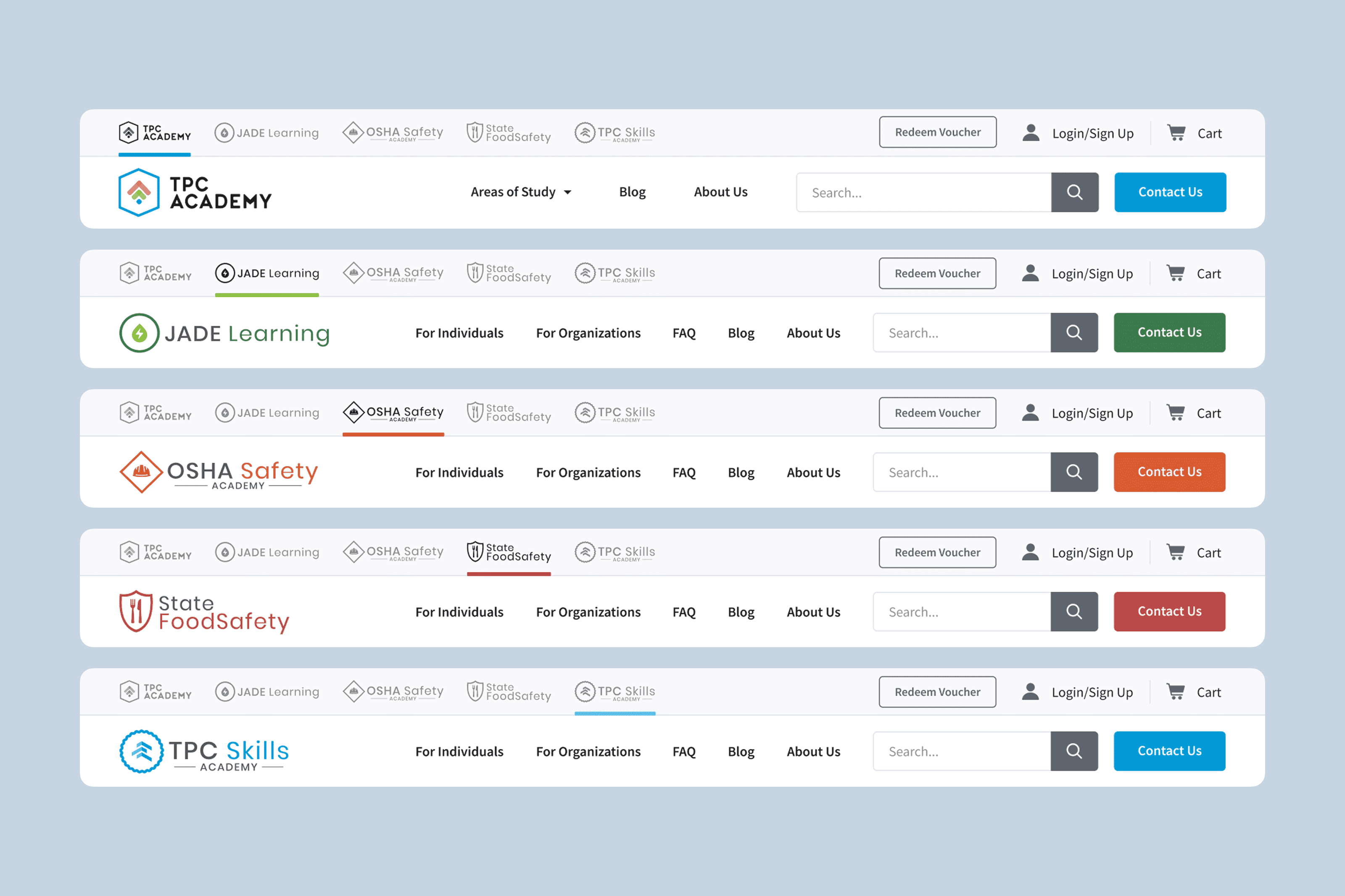
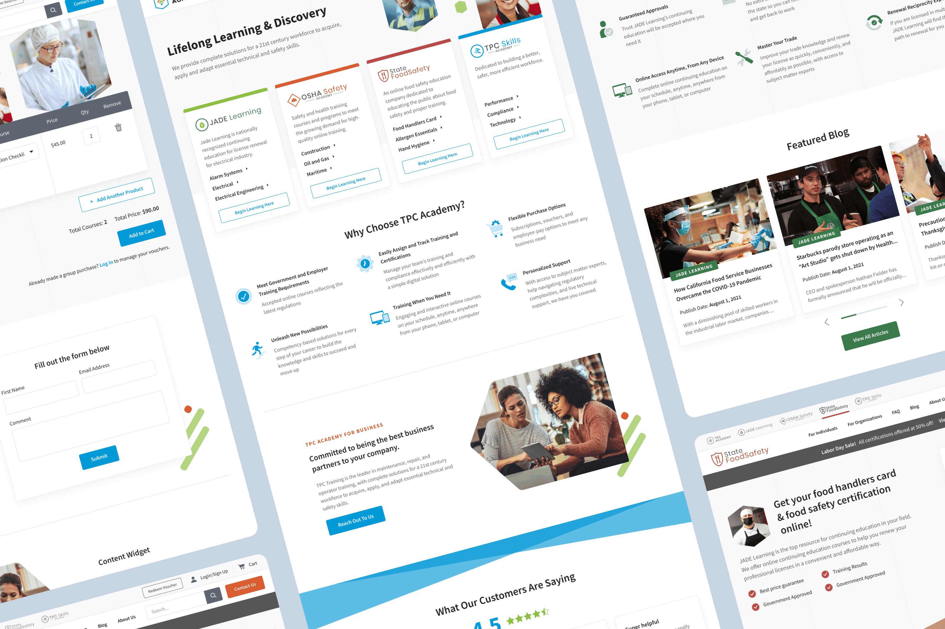
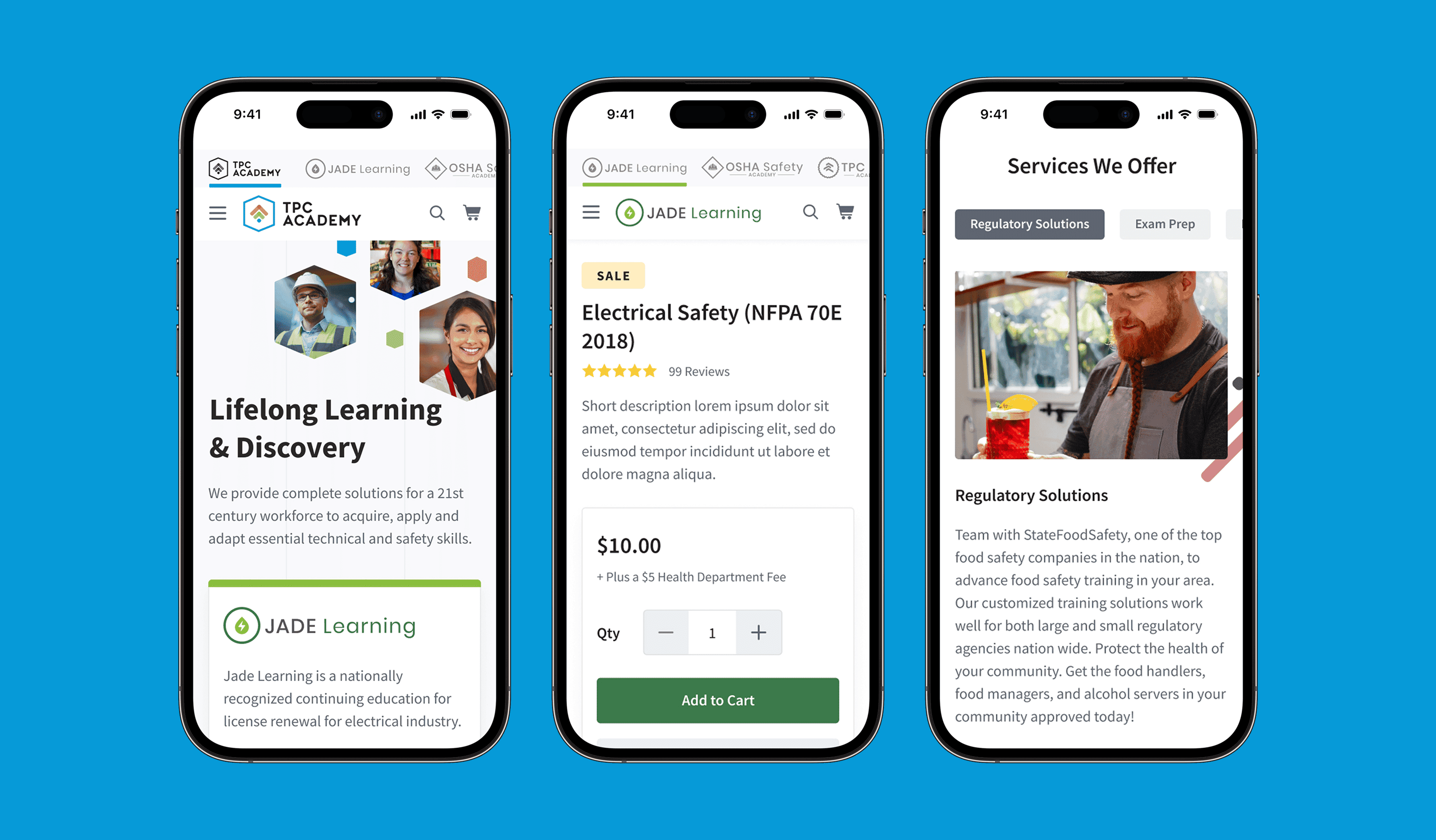
I differentiated each course by color-coding them according to their corresponding program, to ensure that the entire site feels cohesive. The buttons and accent colors would change based on which tab the user is currently on, but the typography, iconography, and visual style would remain consistent across the site. To stand out from the competition, I knew that a polished and modern UI would be what would set TPC apart. I took inspiration from different industries, being careful not to back myself into a “government training website” wall. After researching their industry and the competition, I set out to design a lightweight, clean interface – letting the tastefully-selected images speak for themselves with pops of colors that correspond with the appropriate brand depending on the page the visitor is on.
Results
The result was a clean and elegant website where it felt easy to find and purchase courses. TPC Training was very happy with how the user experience and visuals turned out, and they approved it for development. Unfortunately, the project had to be put on hiatus during mid-development when TPC Training was acquired by the American Safety Council, which led to the website project being put on an indefinite hold. While this was not the ideal outcome, I’m still very grateful to have worked on this design. Collaborating with the client, project managers, and developers to understand the functional requirements and how the designs would be implemented was quite involved, given the project’s vast scope and complex nature. Nevertheless, I found that I enjoyed every minute of it.
Other projects