Dippin' Dots
Client
Website & Marketing Design
Services
I redesigned Dippin’ Dots outdated eCommerce store to provide their customers a stress-free online shopping experience when ordering Dippin' Dots online, while still capturing the brand's playful personality. HIGHLIGHTS +47% Revenue +13% Conversion Rate +20% Transactions +22% Average Order Value ABOUT DIPPIN’ DOTS Dippin’ Dots is a delicious frozen treat made of tiny beads of ice cream, yogurt, sherbet, or flavored ice. Since their inception back in 1988, they've been a hit with children and adults alike and have become a staple in amusement parks and malls.


The challenges of redesigning for a beloved brand
During discovery sessions, the Dippin’ Dots team communicated that their current site does not reflect the direction of their brand. It was playful, but overwhelming because all the information was packed too tightly together. Informative, but not user-friendly. In addition to not being optimized for mobile, the site was slow, which contributed to people dropping off. To put it simply, it was old-fashioned and unsuitable for the “ice cream of the future”. Additionally, Dippin’ Dots products have specific and challenging fulfillment requirements. The products must be shipped and packed with dry ice to keep them from melting during transport. Then, once the package has been delivered, it must be consumed within 24 hours, making the delivery date essential to the customer experience. We needed to find a way to effectively communicate these requirements to customers without stressing them out.


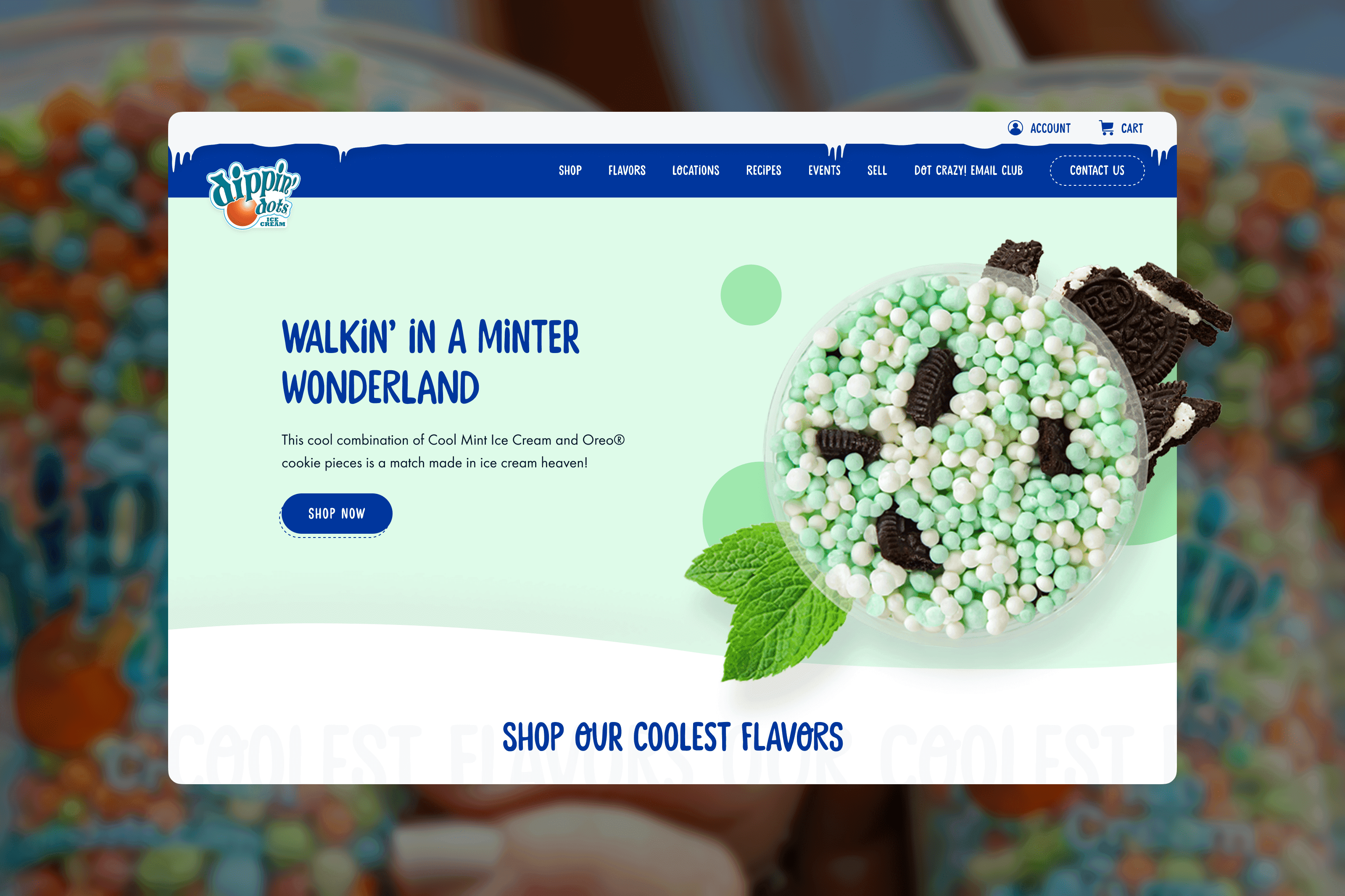
Bridging the retail and digital experience
A bridge between their retail and digital experience was what Dippin’ Dots needed to revitalize their online presence. Collaborating together with their in-house brand team, we crafted a modernized and responsive website that retained and enhanced the nostalgic charm their customers have come to love. By leaning into the "frozen ❄️" aspect of their product, we were able to add much more personality to the site while keeping it approachable for all ages. In addition to icicles and piles of snow, we also dotted the site (pardon the pun) with pops of color that were brought to life using scroll-triggered CSS animations, as well as loading animations made in Lottie. The product images also received a facelift—to make their products more appealing, I came up with the idea of adding in the ingredients behind each product. That way, customers can immediately get an idea of what the flavor profile will be for some of their products (like Rainbow Ice, or Hawaiian Crumble). For the client's convenience, I created a Photoshop template and guidelines that their team could use when they add in new flavors to the website. When it came to simplifying the ordering process and making sure that the ice cream arrives at the right time, I worked with our development team to design a customized shipping calendar and date picker that is integrated into their platform's checkout page. This solution makes it easier for customers to select specific delivery dates, view blackout dates, corresponding shipping methods and costs prior to selecting their delivery date. This way, customers can know exactly when their package will arrive and enjoy their favorite frozen treat without worrying about the product melting in transit.


Results
From updated product cards to subtle animations and meticulous details, the new website feels fun and playful, while still being accessible and responsive on all devices (because you never know when the craving might hit). After the new website launched, Dippin’ Dots saw a 13% increase in their conversion rate and an impressive 47% increase in revenue. The new site also won multiple design awards, which helped increase their visibility and traffic. I’m glad to have made an impact and helped make it easier for people to enjoy Dippin’ Dots from the comfort of their own homes. FUN FACT This project was created in tandem with the redesign of Dippin' Dots’ sister brand: Doc Popcorn. While the tight timeline kept us all on our toes, I had such a fun time working on this project. Huge shout out to our Project Managers for keeping us all in line, and to the Dippin' Dots team for trusting our vision (and for sending us free Dippin' Dots 😋). RECOGNITION Platinum Award (Website Redesign) - Marcom Awards Winner (Website Redesign) - AVA Digital Awards Winner (Special Kudos, UX/UI) - CSS Design Awards
Other projects