Herman Miller
Client
Website Design
Services
First introduced in 1994, the Aeron chair was the brainchild of designers Bill Stumpf and Don Chadwick, who put in years of combined research into the way people sit. Aeron swiftly revolutionized the office furniture industry and proved pioneering in both ergonomics and material innovation. Before starting this concept project, I wanted to choose a company whose values resonate with mine. I chose Herman Miller because they’re a brand I respect, whose dedication to design has been a source of inspiration for me. Among their products, I specifically chose Aeron because of its history of ergonomic innovation and its sexy, minimalist design. Immersing myself in ergonomics, I conducted a competitor analysis and customer journey mapping, audited Herman Miller’s other ergonomic chairs that are around the same price point, reviewed similar products, and delved into case studies and reviews to gain insight into different user groups and to better understand the target audience.
Challenge
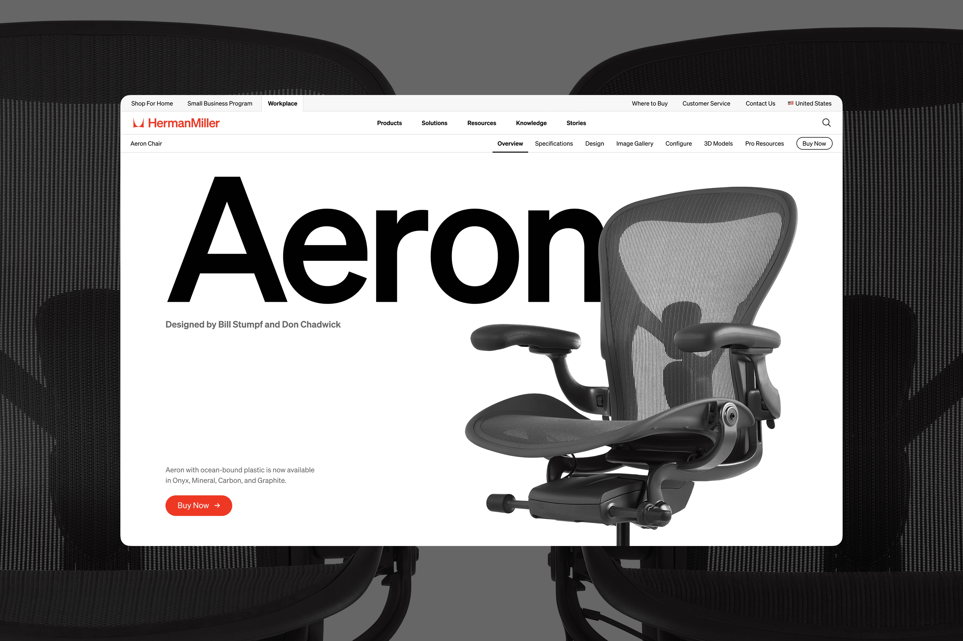
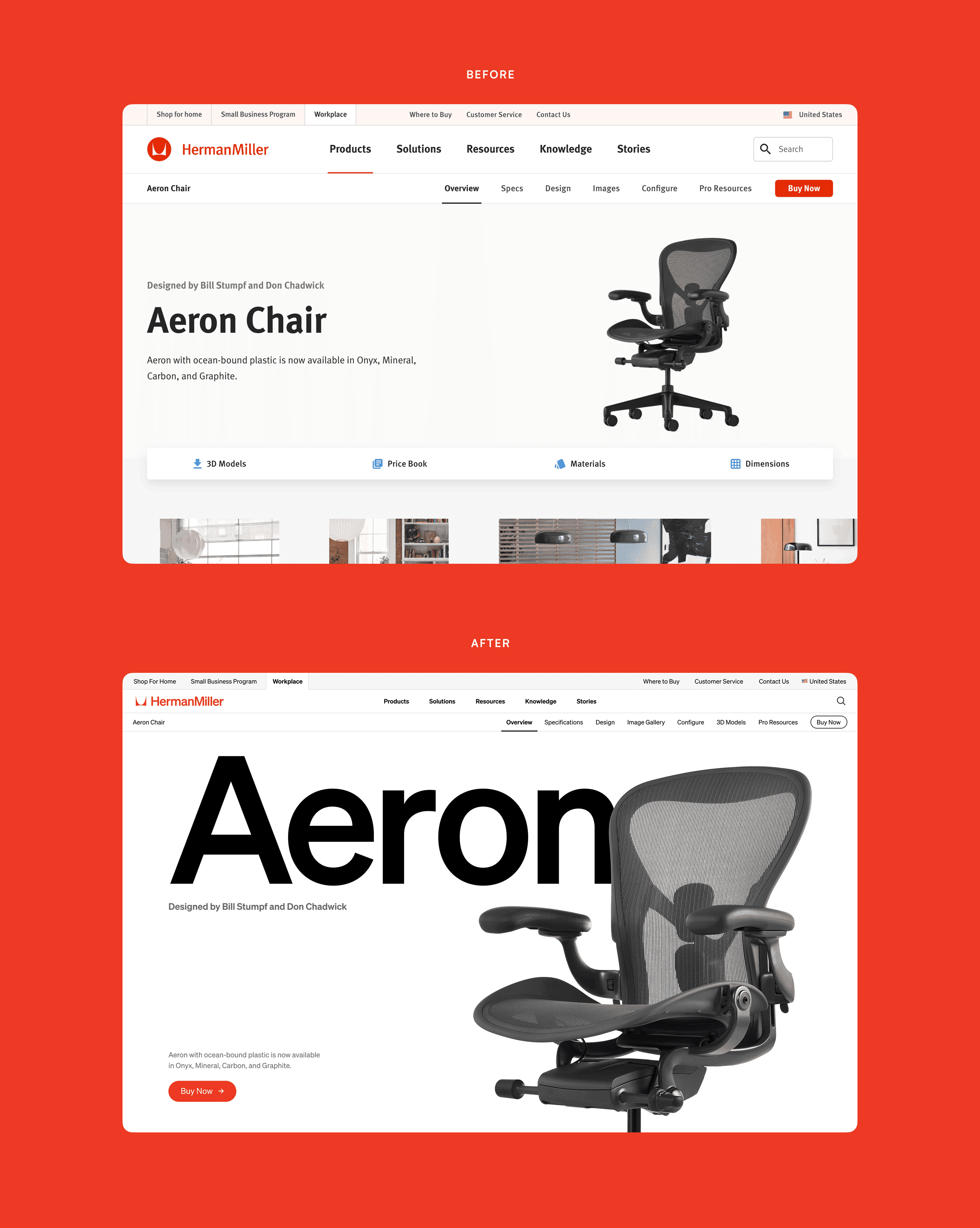
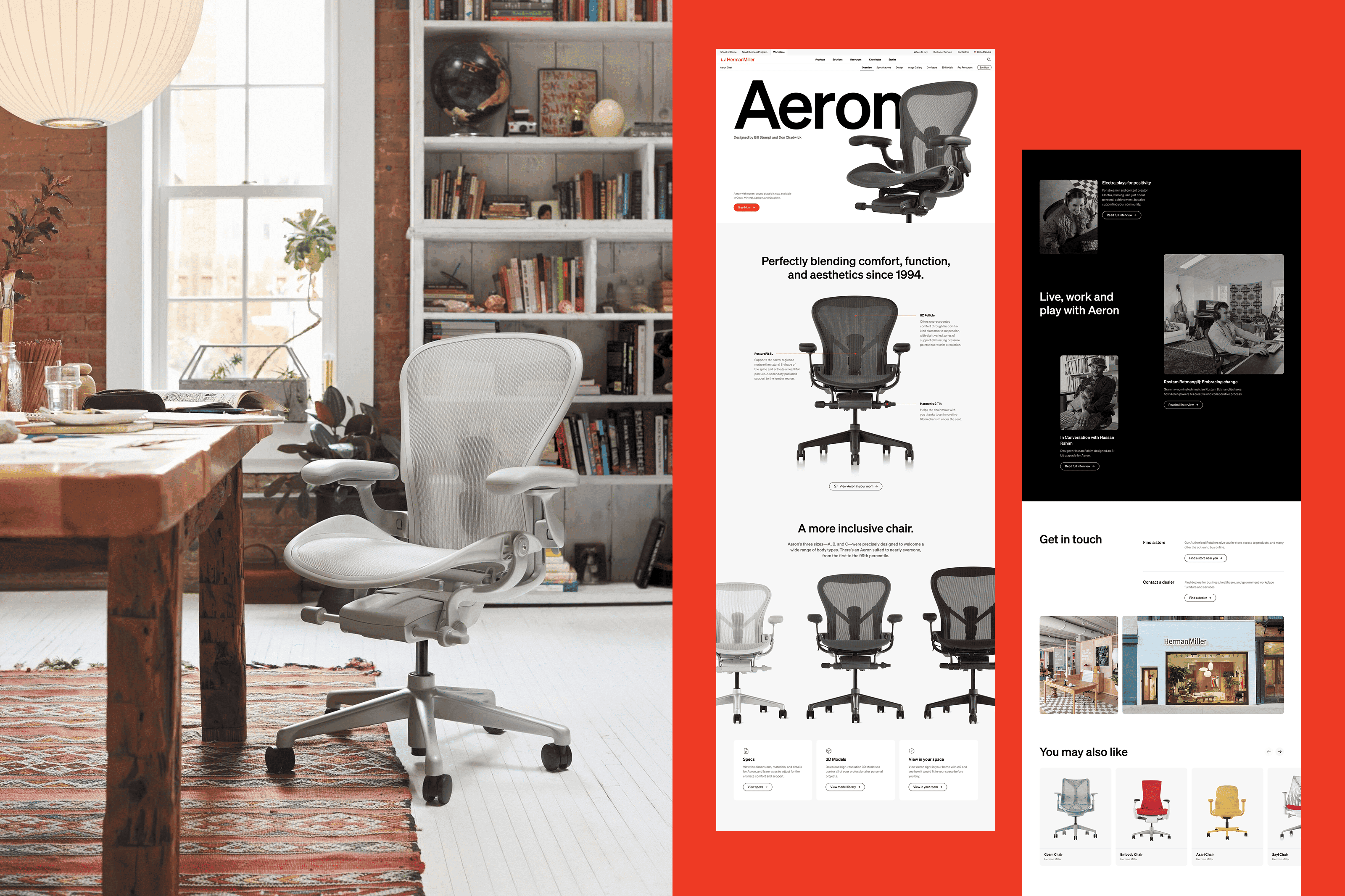
Since this was my first concept project after being laid off, there were times when I missed the structure that typically comes with a 9-to-5 job. While I enjoyed the freedom of not being tied down by a specific platform like BigCommerce or Shopify, I still had to work within certain constraints to ensure that the project prioritized customer experience, was technically feasible, adhered to accessibility guidelines, and wasn’t just “eye candy.” While the current Aeron landing page does the job of showing the product’s features, its presentation felt flat—especially in the hero section, where the treatment of the image felt too simple. The page exists to help visitors learn about the Aeron chair and position it as the best choice for their home office or project. An elegant and well-structured digital experience is an essential part of achieving that goal.
Approach & Solution
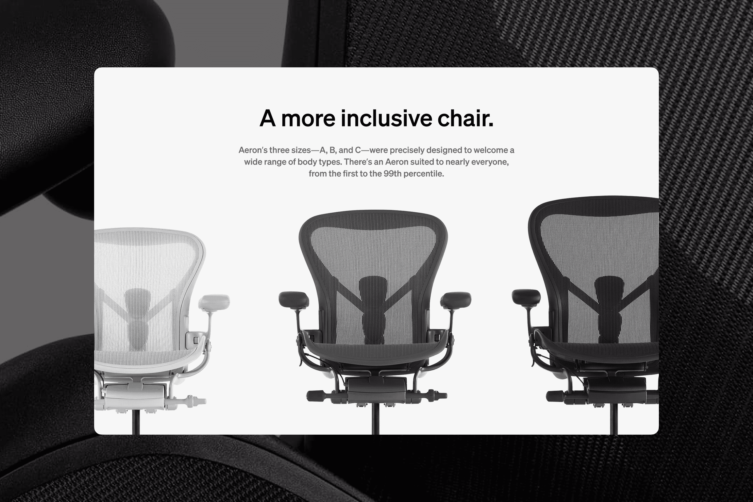
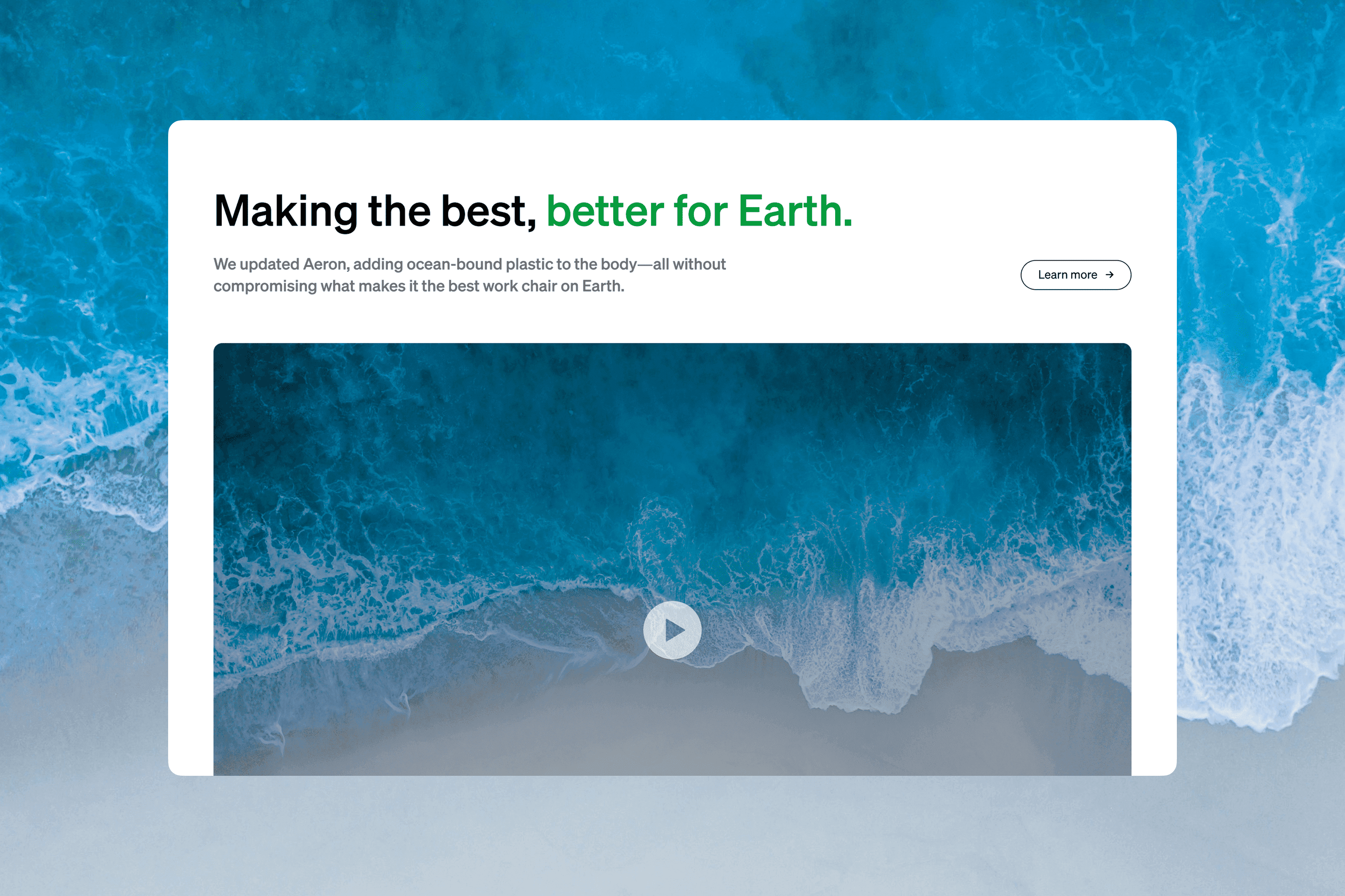
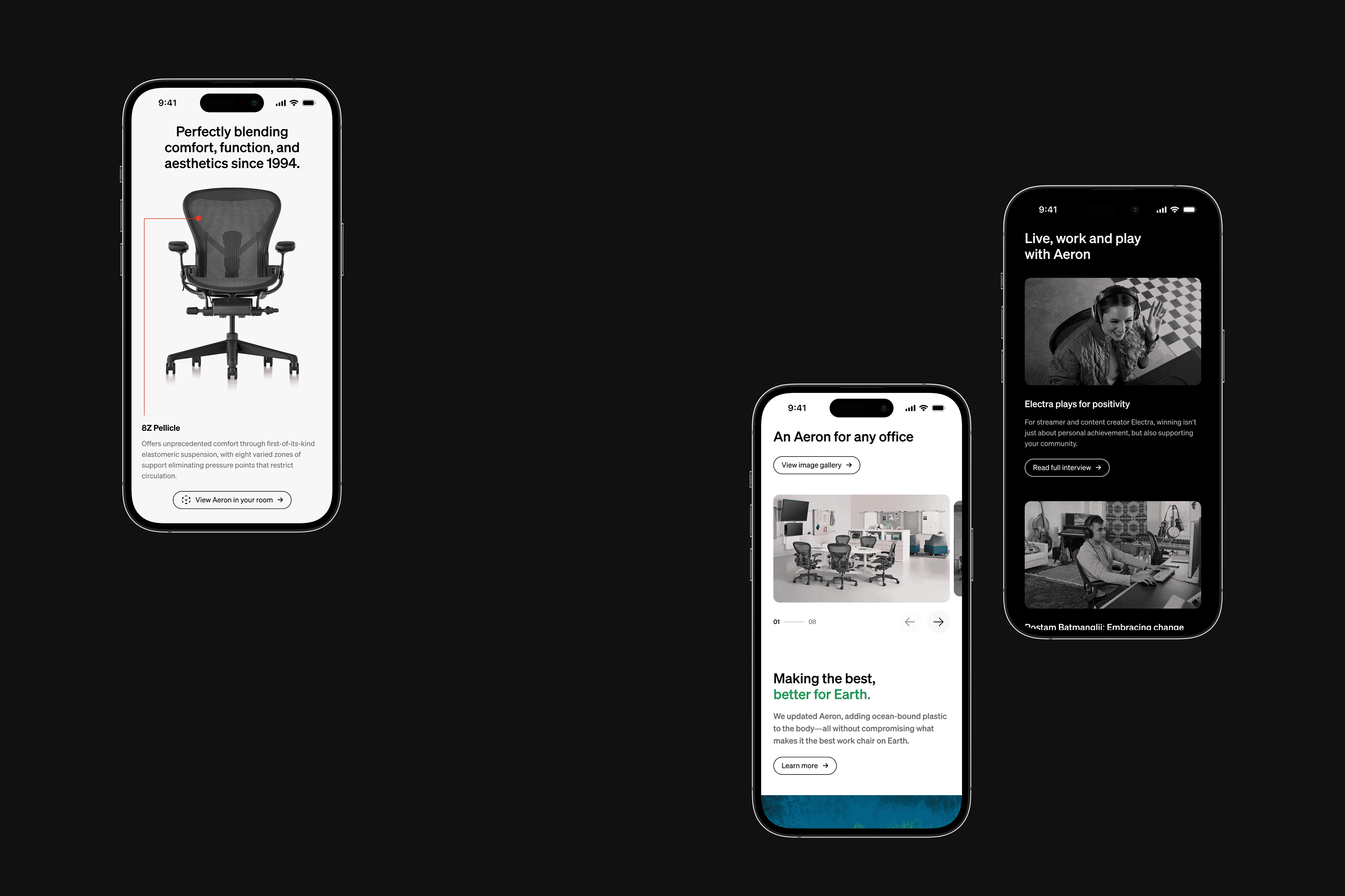
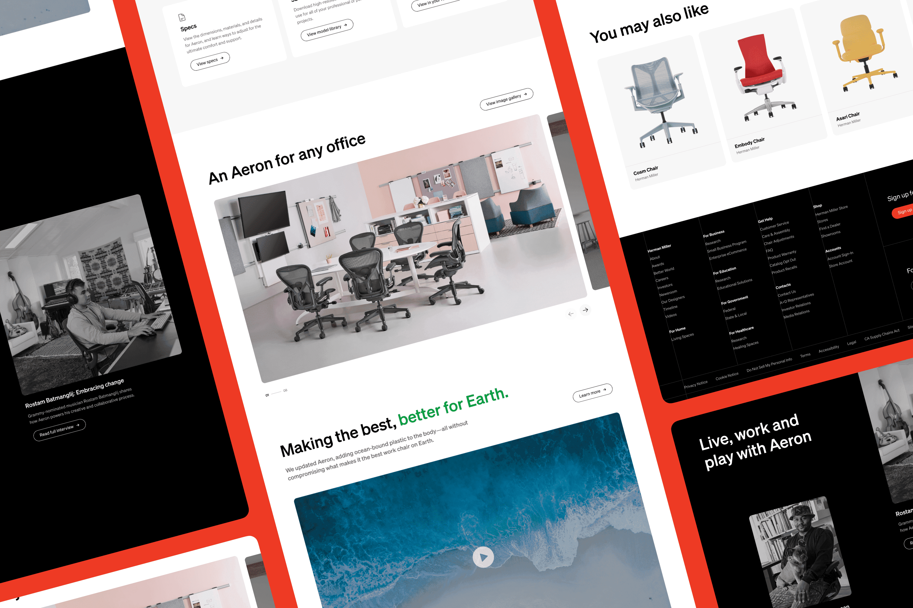
Redesigning the existing Aeron landing page meant transforming it into a more dynamic and engaging site that reflects the updated brand guidelines and does justice to Aeron’s design while keeping its core messaging intact. Unlocking Aeron’s “main character energy” became the guiding principle. As soon as you land on the page, Aeron becomes the center of attention. The text and image in the hero section were dramatically enlarged to make the texture more noticeable and the welcome screen more engaging. The headline was shortened from “The Aeron Chair” to simply “Aeron” to amplify its impact and iconic status. More real estate was given to lifestyle images via a larger gallery slider. A new section was added to highlight interviews with artists and creatives who use Aeron, reinforcing it as the chair for people serious about their craft, well-being, and back support. Staying rooted in human-centered design—a core value of the Herman Miller brand—guided every design decision. The goal was to create a timeless, seamless customer experience.
Results
By strategically restructuring the layout, new life was breathed into the Aeron landing page. The browsing experience remains straightforward, but the product is highlighted in a more intentional and visually engaging way. The enlarged visuals, cleaner messaging, and inclusion of real user stories give visitors a sense of validation and connection to those they admire. These updates collectively provide a more compelling and elegant visual narrative that elevates the overall user experience.
Other projects